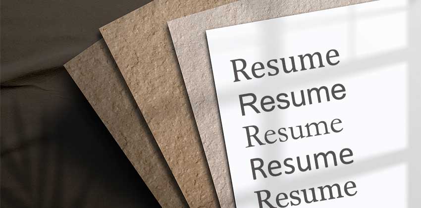
Your job search requires you to make many decisions. And while it’d be easy to overlook the importance of choosing the best font for your resume, you need to ensure that your resume font doesn’t distract a hiring manager’s attention from your message.
You need to consider which resume font to use and what size. But before you start scrolling through hundreds of Google Fonts, read the tips below. Finding the perfect font that communicates friendly professionalism is much easier than you think.
Why Your Resume Font Matters
Before you pick your perfect font, you might wonder if it’s worth your time to even bother with it. The answer is an emphatic yes!
Ensure Clarity for Applicant Tracking Systems
For starters, applicant tracking systems (ATS) need to be able to read your resume to rank it accurately. Hand-written, curly, or stylized fonts might be read as symbols or blanks instead of words. And if an ATS can’t read or rank your resume, it won’t make it past this initial assessment.
Ensure Font Design Doesn’t Distract From Your Skills
After your resume clears an ATS, it lands in front of a recruiter or hiring manager. There’s no official ruling on how long they look at a resume, but the consensus is that it’s a quick once-over.
When you’re trying to find a way to stand out, you might think that a unique font is the way to go. You may be trying to communicate your effervescent personality by choosing a playful font, like trusty old Comic Sans. But you’ll inevitably have the opposite effect on your reader.
When a recruiter has to focus too hard, or the font and style of the resume are distracting, your resume will end up in the recycling bin quickly. Instead, you want to choose a professional font and let your accomplishments and skills be the attention-grabbers.
Build a Virtual Resume That Displays Well
Additionally, hiring managers spend most of their time looking at screens in today’s tech-heavy world. If they view your resume online, you want to ensure it feels natural and comfortable for them. Professional fonts that are generally found on the web can make it a more comforting and enjoyable experience for them.
What Font Should You Choose for Your Resume?
So, what font should you select for your resume? You can break it down into two camps. On one side are serifs, and on the other side are san serifs. If you’ve never drooled over typography, you might not know which is which, but you may recognize the word “sans” as “without.”
Choosing Between a Serif and Sans Serif
In this case, the sans fonts are without the tiny decorative stroke at the end of each letter. Need help determining which you have? Type a capital M. Does your letter have small lines extending from the ends? If so, you have a serif font.
So, which is the right choice? Simply put, either font could be a good choice, but serif fonts are often seen as more formal and classic. If you’re in a field like higher education or applying for a traditional role, such as at a museum, serif probably makes sense.
On the other hand, if you’re applying for a less formal position, sans serif fonts generally feel more modern and inviting. You get to decide which font style communicates your intentions.
It’s also important to note that you shouldn’t use custom fonts you’ve had to download and install. They won’t render correctly on the hiring manager’s screen, and your resume will likely be unreadable.
List of Professional Fonts for Resumes
Once you’ve chosen to sans or not to sans, you can select a specific font from that family. Here’s a list of the top professional fonts to consider for your resume.
Serif Fonts
- Cambria
- Garamond
- Georgia
- Times New Roman
Sans Serif Fonts
- Arial
- Calibri
- Gill Sans
- Helvetica
- Tahoma
- Verdana
What Size Font Should You Use?
Now that you’ve selected your font, you just need to choose the right size. The size of your font needs some consideration for a few reasons.
A font that’s too small will be challenging to read. On the flip side, a font that’s too large takes up too much space. You will only be able to fit in some of your essential information if your font is too large.
There’s no specific size to select, as fonts and resume templates vary significantly. As a general rule, though, try to keep your font between 10-12 points in size.
Use the same font for your headings, but find a way to make them stand out. Often, that means headers will be one to two points larger than the body of your resume, or use bolding. Regardless of your choice, make sure that your font is consistently sized and formatted throughout your document.
And remember that your name should always be at the top of the document with the largest-sized font. You can always add visual appeal by using italics, underlines, and pops of color, but use these sparingly.
Choose the Same Font for Your Cover Letter
Now that all your resume font choices have been made, you can carry that same font into your cover letter. While your cover letter is an opportunity to show some personality, cohesive formatting with your resume will convey better professionalism and personal branding.
Finding the Perfect Font for Your Resume
Using the wrong font for your resume can make or break your application’s success. Explore the world of serif fonts and sans serif fonts to achieve a professional and inviting appearance perfect for your resume and your target role. Once you find one that speaks to you and fits your industry, test it out and ensure that it fully communicates your vision.
Don’t forget to share this article with friends!


